by Joshua Porter | August 1st, 2012 | shortlink: http://bokardo.com/p/2107
It could be that your users are always attentive, always aware of what’s going on with you and your product or service. They are always up-to-date with what you offer, where they are in their progress with you, what account they’re logged in with, what payment plan they’re on, and what they were doing last with your product.
Or, it could be that they’re just like the rest of us and trying to stay afloat while their attention is being pulled in a thousand directions at once and could use you reminding them what seems like it should be obvious.
A couple points about obvious:
- Obvious almost always isn’t. With the sheer number of different world views people have these days one person’s obvious is another person’s revelation.
- Nobody minds when we state the obvious. Not even geniuses. That’s because it’s a helpful part of normal human communication…where we set context in talking with others. It builds confidence that we understand each other and are on the same page. It is often necessary before jumping to that the next step in the lifecycle.
- In UI design, obvious is usually about describing a user’s current state. As I wrote about in Designing for the Next Step, communicating the current state is a crucial part of preparing someone to take the next step. To gain confidence about where we might go we first need to know where we are.
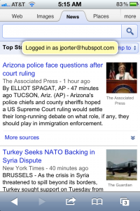
The other day when I logged into Google on my iPhone I was presented with a simple little message telling me what account I logged in with. (I have three Google accounts…I think)
As a designer it would have been super easy to assume that this wasn’t necessary…indeed for a while Google didn’t tell you what account you logged in with, but then it became frustrating when you tried to access your Gmail or Calendar when you were logged in with a different account. By stating the obvious (that you just logged in with a certain account) Google is making it more likely that you don’t have this frustration anymore. (granted the mere fact that we log in with different accounts to the same service is a problem in itself…this is a decent solution for the current structure of Google’s service)
In short, stating the obvious too often gets a bad rap. But when the first priority of user interface design is clarity, often the most important thing we can do is to state the obvious.

